I noticed this morning (on Mastodon) a post about Google’s Stitch AI design tool. So I thought I’d have a little play with it.
Baseline Web App
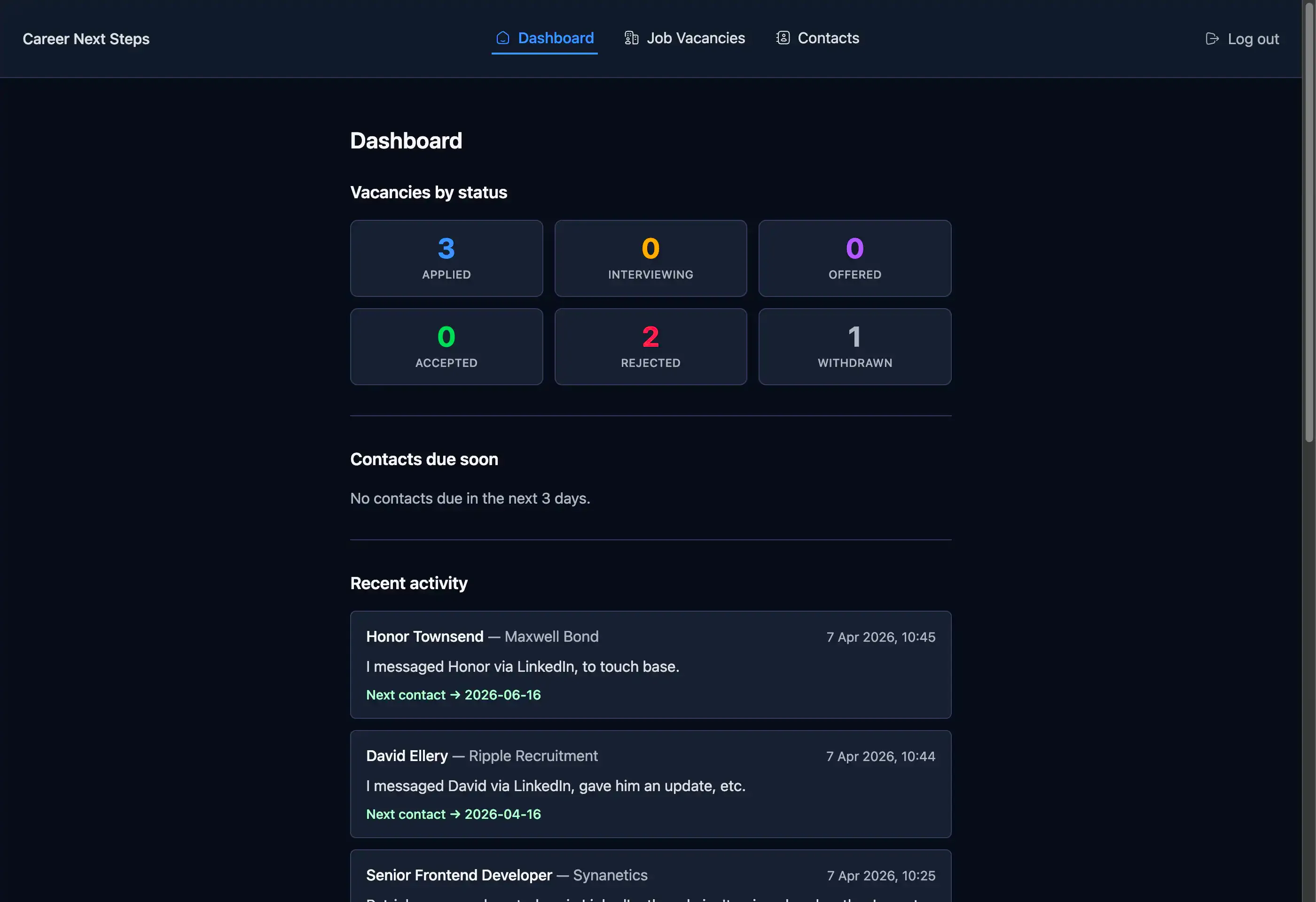
To help with my job search, and to learn more about React/Next.js I’ve created a job vacancy tracker (it also allows the user to keep tabs on any recruiters they’re in contact with). It’s a fairly simple web app.
I thought this would be a good candidate to see what Stitch would propose, and if it threw out anything of interest I could easily adapt my web app with the improvements, if any.
Prompt
The prompt I gave it was very generic.
Propose a redesign of my job application tracker web appIt was accompanied by the above screenshot.
After about a minute of thinking it came back with the following options. In true AI style, there were three of them!
Response
Below are the three options it proposed.
Version v1
A sophisticated dark-mode layout featuring a sidebar navigation, modern card-based stats with vibrant accents, and a clean, organized activity feed.
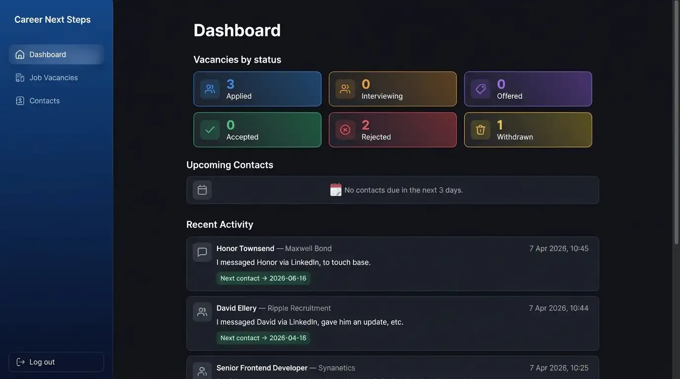
Likes
- At a push, maybe the gradient backgrounds for the “Vacancies by status” cards. Maybe.
Dislikes
- Sidebar, no need for it, the web app has very simple navigation.
- Inconsistent widths of the main content sections; “Vacancies by status” is slightly narrower than upcoming contacts and recent activity.
- Additional icons, again no need for it.
- Emoji for upcoming contacts empty state, it’s just not consistent with the rest of the iconography it proposed.
Version v2
A professional light-themed version with high contrast, featuring a prominent doughnut chart for application tracking and a task-oriented approach to upcoming contacts.
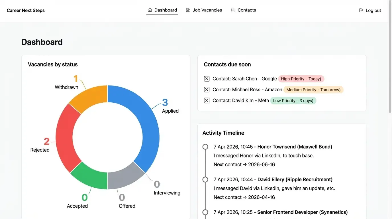
Likes
- Using a donut chart for the “Vacancies by status” is a decent proposal.
Dislikes
- Using a donut chart for the “Vacancies by status” as it will add additional payload resource to generate it, and isn’t worth the data it would require.
- Checkboxes (I think?) in “Contacts due soon” items, is it proposing these become todo items?
- The orphaned
)in the priority chips, in “Contacts due soon”, is bazar! And nowhere is there a status set for contacts. Maybe I could use thenext_contact_dateto compare to the current date to determine the dynamic priority chip? But this isn’t required. - Inconsistent gap spacing (horizontal and vertical) between the main contact cards.
Version v3
A futuristic “glassmorphism” aesthetic with semi-transparent panels, neon status icons, and a horizontal carousel for tracking urgent contacts.
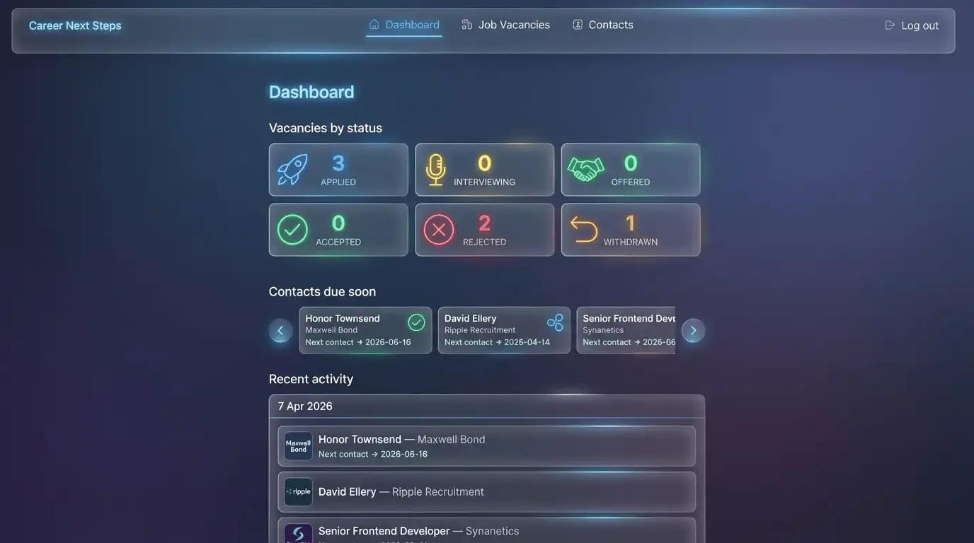
Likes
- Grouping the “Recent activity” items with a date header could make sense, the list will never be more than 10 items, however it might reduce repetitive dates being displayed.
Dislikes
- The main navigation is hideous. The items aren’t aligned centrally.
- Again additional icon suggestions aren’t needed.
- The “Contacts due soon” carousel is awful. If there’s more than 3 recruiters I need to contact I want to see the data without having to interact with the UI.
Conclusion
I’m not sold. Sure, it came back with some alternative methods to display content. But the quality is lacking, in a big way. The user experience isn’t carefully considered. And even proposing “glassmorphism” is just horrid.
As with any AI tool, context is king. With more specific prompts it may have produced tailored designs, but for this particular experiment I wanted to remain vague. However, I’m not convinced including further context would resolve many of the design inconsistencies I’ve mentioned.